css布局——定位
相对定位允许元素。当元素被设置为相对定位后,可以使用属性来调整它的位置,而。特点:1.,元素位置变化只是视觉效果上的变化,不会对其他元素产生任何影响。2.,若两个元素都进行定位,则后加入的元素层级更高。3.left不能和right一起设置,top和bottom不能一起设置。4.相对定位后也能用margin和浮动,但不推荐。(在浏览器的渲染流程中,.outerwidth;height;;paddin
css布局——定位
(1)相对定位 positon:relative;
相对定位允许元素相对于其原始位置进行偏移。当元素被设置为相对定位后,可以使用top、right、bottom和left属性来调整它的位置,而不会影响其他元素的布局。
特点:
1.不会脱离文档流,元素位置变化只是视觉效果上的变化,不会对其他元素产生任何影响。
2.定位元素的显示层级比普通元素高,若两个元素都进行定位,则后加入的元素层级更高。
3.left不能和right一起设置,top和bottom不能一起设置。
4.相对定位后也能用margin和浮动,但不推荐。
(在浏览器的渲染流程中,浮动(float)的处理早于定位(position))
基础用法:
position:relative;
left:100px;    /*距离左侧100px*/
示例:
<style>
.outer{
width: 200px;
height: 400px;
background-color: bisque;
padding: 20px;
}
.outer>div{
width: 100px;
height: 100px;
}
.box1{
background-color: pink;
}
.box2{
background-color: rgb(112, 216, 124);
}
.box3{
background-color: rgb(112, 173, 216);
}
</style>
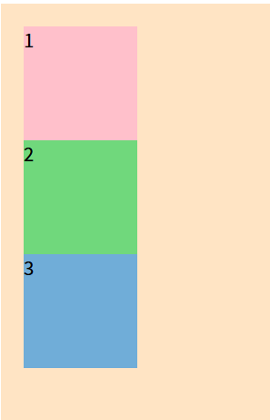
<body>
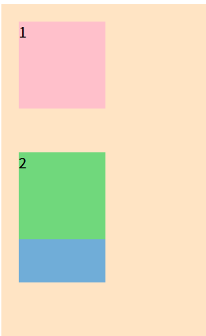
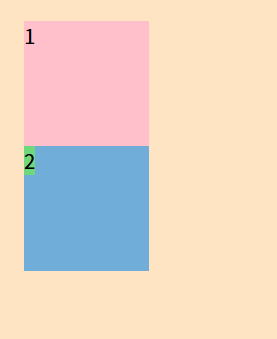
<div class="outer">
<div class="box1">1</div>
<div class="box2">2</div>
<div class="box3">3</div>
</div>
</body>
.box2{
  background-color: rgb(112, 216, 124);
  position: relative;
  left: 100px;      /* 为box2添加相对定位,离左边100px */
 }
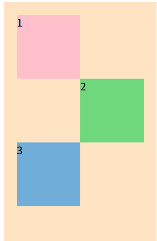
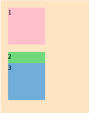
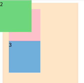
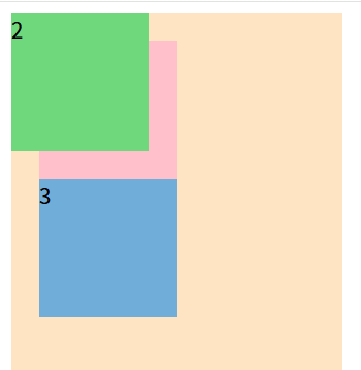
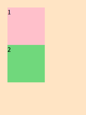
可以发现当box2向右移动100px后,box3并没有向上替代box2的原始位置。
这是因为元素虽然移动了,但在文档流中仍然占据原来的位置。可以理解为金蝉脱壳,蝉离开的但壳还在。
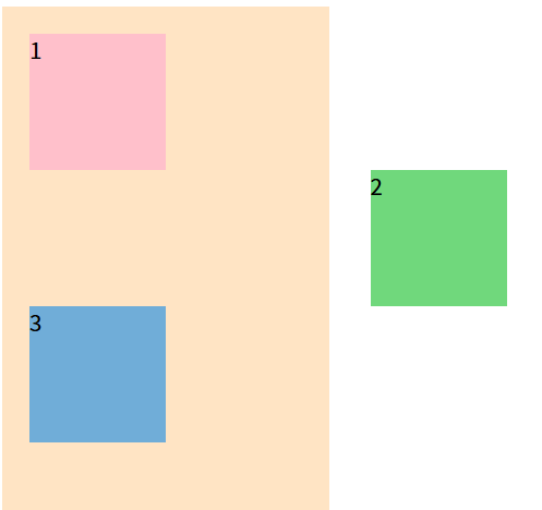
另外为元素添加相对定位甚至可以超出它的父盒子。
.box2{
  background-color: rgb(112, 216, 124);
  position: relative;
  left: 250px;
 }
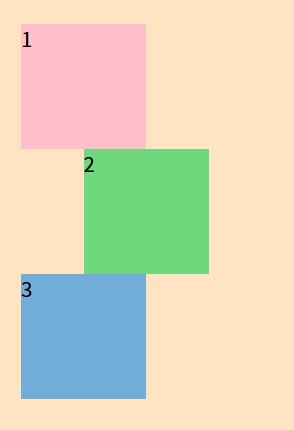
当同时设置left和right的话,left生效而right不生效,无论谁先谁后。
.box2{
  background-color: rgb(112, 216, 124);
  position: relative;
  left:50px;
  right: 50px;
 }
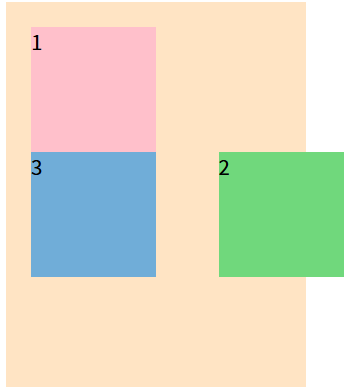
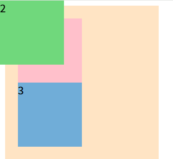
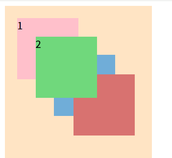
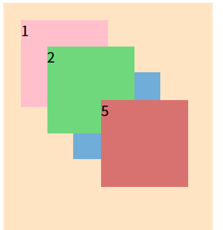
当box2设置定位向下移动后会“压在”box3身上,当box2和box3都设置定位移动时box3会压在box2身上,这是因为设置定位元素的显示层级比普通元素高,若两个元素都进行定位,则后加入的元素层级更高。
.box2{
  background-color: rgb(112, 216, 124);
  position: relative;
  top:50px;
 }
.box2{
  background-color: rgb(112, 216, 124);
  position: relative;
  top:20px;
 }
 .box3{
  background-color: rgb(112, 173, 216);
  position: relative;
  bottom: 50px;
 }
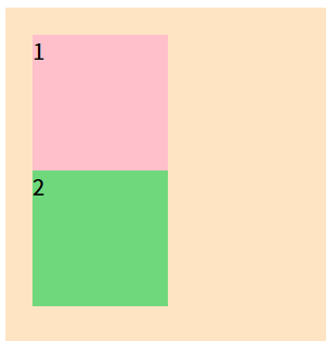
相对定位可以同浮动一起使用。当为box2设置left:50px;float:right;元素首先向右浮动,然后相对定位向右又移动了50像素,因为浮动脱离文档流,box3替代box2初始位置。
.box2{
  background-color: rgb(112, 216, 124);
  position: relative;
  left:50px;
  float: right;
 }
(2)绝对定位 positon:absolute;
绝对定位是一种强大的布局技术,通过top、right、bottom和left属性相对于最近的已定位祖先元素进行定位。
绝对定位的参考点是它的包含块。
包含块:
1.对于没有脱离文档流的元素,它的包含块是它的父盒子;
2.对于脱离文档流的元素,第一个开启定位的祖先元素就是它的包含块。
3.若所有祖先都没有开启定位,则包含块为浏览器视口(html)。
特点:
1.脱离文档流,会对后面的兄弟元素、父元素产生影响。
2.left和right不能一起使用,top和bottom不能一起使用。
3.绝对定位和浮动不能一起使用,若同时设置则浮动无效,一定位为主。
4.绝对定位也能通过margin调整位置,但并不推荐。(绝对定位left了margin-left才有效)
5.无论行内、块级、行内块元素,设置了绝对定位后,都变为定位元素,定位元素宽高默认内容撑开,也可以设置宽高。
口诀:子绝父相。
子元素开启绝对定位那么它的父元素就要开启相对定位。
应用场景:
创建重叠元素,当鼠标悬停时,被覆盖元素显现(京东导航栏)
示例:
.box2{
  background-color: rgb(112, 216, 124);
  position: absolute;   /*box2会脱离文档流盖在box3上,相对浮动box3的文字没有被丢出去*/
 }
.box2 {
      background-color: rgb(112, 216, 124);
      position: absolute;
      top: 0px;
      left: 0px;
    }
可见box2的顶部和左边紧贴浏览器窗口,这是因为box2的父盒子outer并没有设置定位,所以浏览器窗口变成box2的包含块。
 .outer {
      position: relative;
    }
  .box2 {
      background-color: rgb(112, 216, 124);
      position: absolute;
      top: 0px;
      left: 0px;
    }
当为outer添加相对定位后,box2的包含块变为它的父盒子。
.box2 {
      background-color: rgb(112, 216, 124);
      position: absolute;
    }
    <span class="box2">2</span>
 .box2 {
      background-color: rgb(112, 216, 124);
      position: absolute;
      width: 100px;
      height: 100px;
    }
     <span class="box2">2</span>
只要是添加了绝对定位的元素,无论它是块级、行内还是行内块元素,他都变为了定位元素。定位元素的宽度默认由内容撑开,另外他也可以设置宽度和高度。
 .box2 {
      background-color: rgb(112, 216, 124);
      position: absolute;
    }
    .outer:hover .box2{
      left:120px;
    }
上面代码是给outer添加了鼠标悬停,则box2向右移动,显示出box3。
(3)固定定位 positon:fixed;
给元素设置positon:fixed;可以实现固定定位,同时使用top、bottom、left、right四个属性调整位置。
参考点:视口
和绝对定位不同的是,绝对定位为父元素添加相对定位,参考点会变为父元素。而为固定定位元素的父元素添加相对定位,参考点依旧是视口。
特点:
1.脱离文档流,对后面的兄弟元素和父元素有影响。
2.left和right、top和bottom不能一起使用。
3.固定定位和浮动不能一起使用,若同时设置,则浮动无效。
4.固定定位的元素可以通过margin调整位置,但不推荐。(top、bottom、left、right写了谁才可以用margin谁)
5.无论什么元素(行内。行内块、块级)设置了固定定位后,就变为定位元素。
用法:
 .box2 {
      background-color: rgb(112, 216, 124);
      position: fixed;     /*脱离文档流*/
    }
 .outer {
      position: relative;
    }
 .box2 {
      background-color: rgb(112, 216, 124);
      position: fixed;
      top:0px;
      left:0px;
    }
 .box2 {
      background-color: rgb(112, 216, 124);
      position: fixed;
      top:0px;
      left:0px;
    }
可以看到无论给不给父元素添加相对定位,固定定位的元素参考点一直是浏览器视口。这点与绝对定位不同,绝对定位为父元素添加相对定位,视口就变为了父元素。
简单的来说,固定定位就像把一个贴纸贴在窗户上,无论外面的景色如何变换,以什么视角去看贴纸的位置,它的位置一直是固定的,在网页编写时,主要用于写网页狗皮膏药广告。而绝对定位就像是把贴纸贴在窗外的某个物体上,变换视角,它的位置也会发生相应变化。
 .box2 {
      background-color: rgb(112, 216, 124);
      position: fixed;
      top:0px;
      left:0px;
      float:right;   /*同时设置固定定位于浮动,浮动无效*/
    }
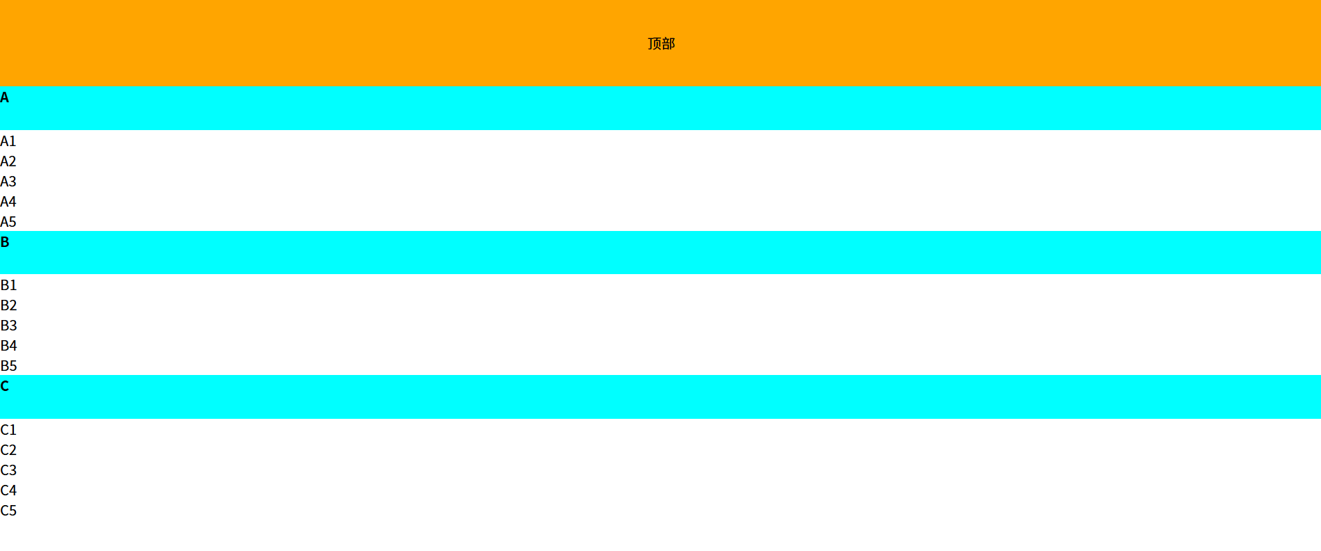
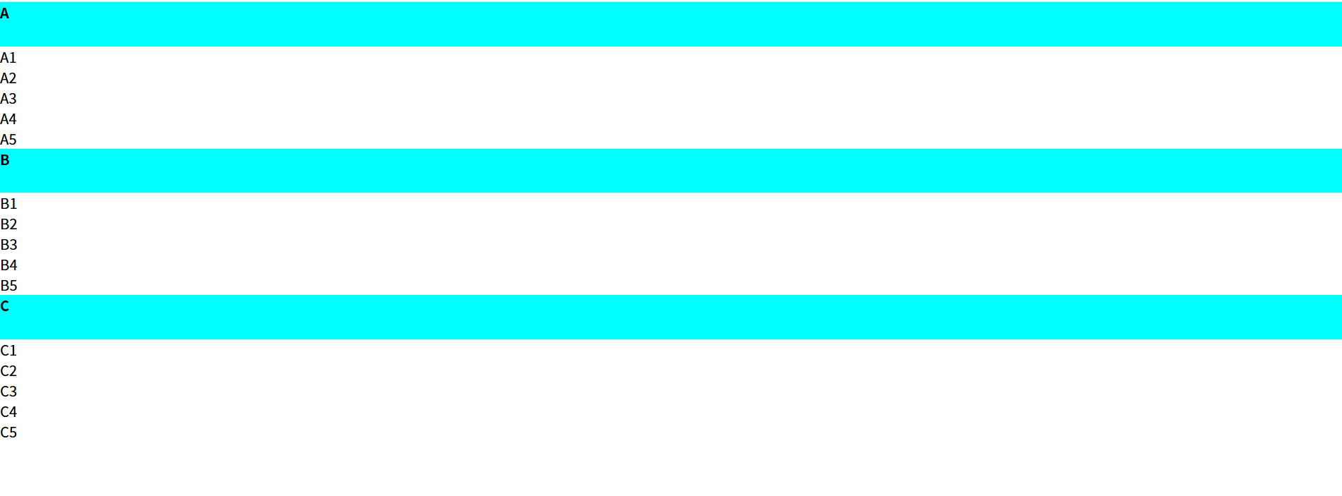
(4)粘性定位 positon:sticky;
粘性定位就像当某个元素运动到某个区域会像胶水一样把它粘住,他其实可以认为是相对定位和固定定位的结合版。当设置粘性定位的元素并为到达规定位置时是相对定位,当到达规定位置时,转变为固定定位,直到相对定位元素脱离了它的父元素时,它会被父元素带走。
通过给元素设置positong:sticky;可以实现粘性定位,同时可以使用top、bottom、left、right四个属性调整位置,不过最常用的还是top:0px。(在设置粘性定位同时必须设置方向属性,否则无效)
用法:(上下滑动)
.first{
      /* 粘性定位*/
      position: sticky;
      top: 0px;
    }
参考点:离他最近的一个拥有滚动机制的祖先元素,即使这个祖先不是最近的真实可滚动的祖先。
特点:
1.不脱离文档流。
2.最常用的是值是top(上下滑动)
3.粘性定位和浮动可以同时设置,但不推荐。
4.粘性定位元素可以设置margin,但不推荐。
5.父元素不能设置 overflow: hidden /auto/scroll,否则粘性定位可能失效。
使用场景:
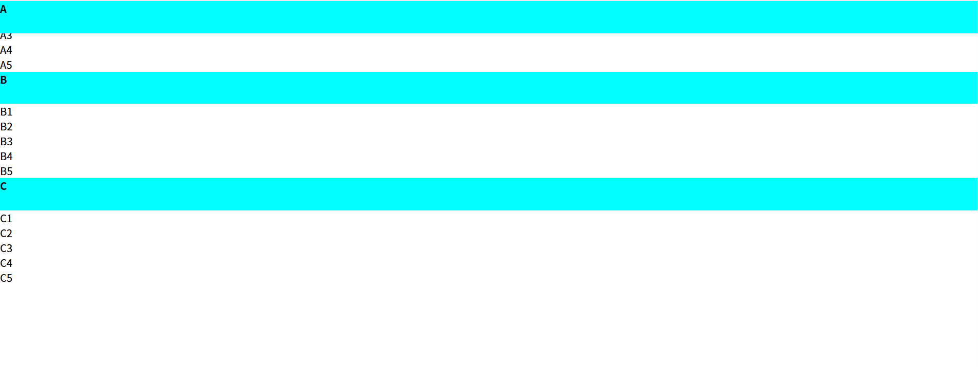
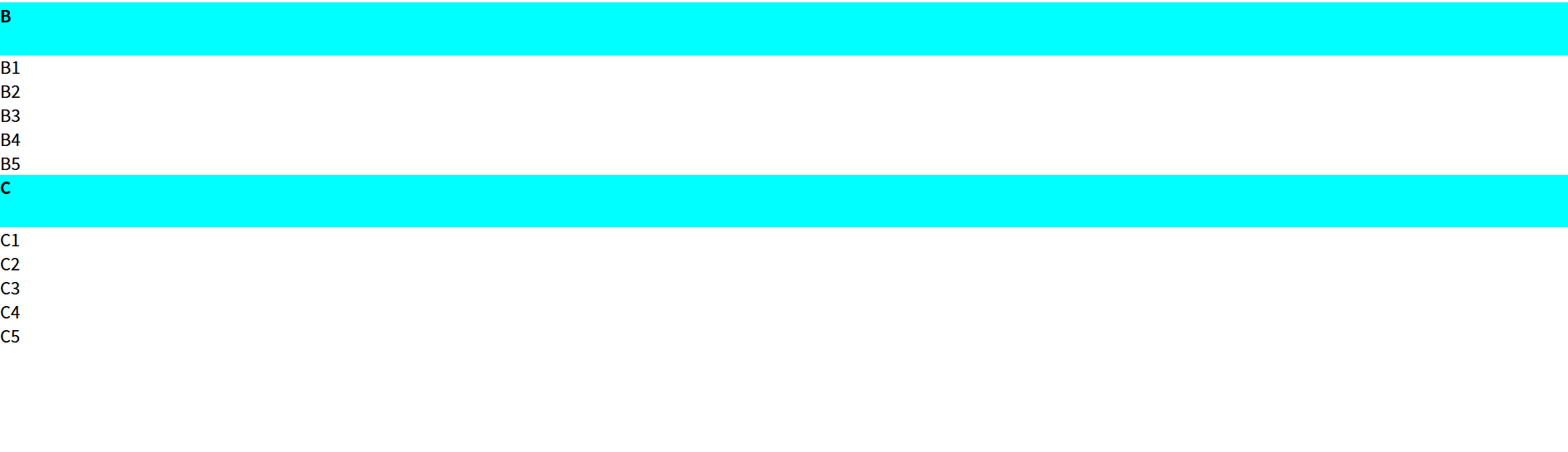
导航栏:滚动到顶部时固定导航。
 <style>

    *{
      margin: 0;
      padding: 0;
    }
    .header{
      height: 100px;
      background-color: orange;
      text-align: center;
      line-height: 100px;
    }
    .content{
      height: 1500px;
    }
    .first{
      height: 50px;
      font-weight: 700;
      background-color: aqua;
      /* 粘性定位*/
      position: sticky;
      top: 0px;
    }
  </style>
</head>
<body>
 <div class="header">顶部</div>
 <div class="content">
  <div>
    <p class="first">A</p>
    <p>A1</p>
    <p>A2</p>
    <p>A3</p>
    <p>A4</p>
    <p>A5</p>
   </div>
   <div>
    <p class="first">B</p>
    <p>B1</p>
    <p>B2</p>
    <p>B3</p>
    <p>B4</p>
    <p>B5</p>
   </div>
   <div>
    <p class="first">C</p>
    <p>C1</p>
    <p>C2</p>
    <p>C3</p>
    <p>C4</p>
    <p>C5</p>
   </div>
 </div>

</body>
↓
↓
↓
(5)定位层级 z-index
无论是相对定位、绝对定位、固定定位、粘性定位,他们的层级是一样的,他们都比没有定位的元素层级高。
普通元素< 相对定位=绝对定位=固定定位=粘性定位
如果发生重叠,默认情况下:后面的元素会压在前面元素之上。
z-index的属性值是数字,没有单位,值越大层级越高。
只有定位的元素设置z-index才有效。
如果z-index值大的元素依然无法覆盖z-index小的元素,那么请检查其包含块的层级。
  <style>
    .outer{
     width: 200px;
     height: 400px;
     background-color: bisque;
     padding: 20px;
     position: relative;
    }
    .outer>div{
     width: 100px;
     height: 100px;
    }
    .box1{
     background-color: pink;
    }
    .box2{
     background-color: rgb(112, 216, 124);
     position: relative;
     left: 30px;
     bottom: 70px;
    }
    .box3{
     background-color: rgb(112, 173, 216);
     position:absolute;
     top: 80px;
     left: 80px;
    }
    .box4{
     background-color: rgb(216, 114, 112);
     position: fixed;
     top: 120px;
     left: 120px;
    }
     </style>
     <body>
    <div class="outer">
     <div class="box1">1</div>
     <div class="box2">2</div>
     <div class="box3">3</div>
     <div class="box4">4</div>
    </div>
   </body>
之所以4压着3压着2,是因为他们的声明顺序,如果3在4后声明,则是3压着4,无关他们的层级。
那如果我们不调整元素的声明顺序,想让2压在3和4的上面,就要用到一个属性:z-index。
z-index就是用来调整z轴的。z-index越大,它的层级越高,z-index越小,层级越低。
z-index的默认值为auto,其实就是z-index:0;谁压谁完全取决于谁后声明。
 .box2{
     background-color: rgb(112, 216, 124);
     position: relative;
     left: 30px;
     bottom: 70px;
     z-index:1;
    }
但需要注意的是:父盒子的z-index可能会拖累子元素。
<style>
  .outer{
     width: 200px;
     height: 400px;
     background-color: bisque;
     padding: 20px;
     position: relative;
     z-index:2;
    }
     .box4{
     background-color: rgb(216, 114, 112);
     position: fixed;
     top: 120px;
     left: 120px;
     z-index: 50;
    }
    .box5{
     background-color: rgb(216, 114, 112);
     position: fixed;
     top: 120px;
     left: 120px;
     z-index: 10;
    }
    </style>
     <body>
    <div class="outer">
     <div class="box1">1</div>
     <div class="box2">2</div>
     <div class="box3">3</div>
     <div class="box4">4</div>
    </div>
    <div class="box5">5</div>
   </body>
4的z-index分明比5的大,但5居然压在4的上面?
这是因为4的父盒子outer的z-index是2,小于5的z-index,哪怕4的z-index多大,他都不可能压着5。
(6)定位其他注意点
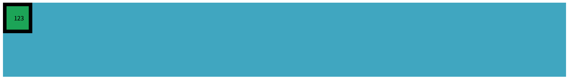
1.定位可以越过padding。
 <style>
    .outer{
      background-color: rgb(64, 166, 192);
      width: 400px;
      height: 400px;
      padding: 30px;
      position: relative;
    }
    .box{
      background-color: rgb(28, 164, 87);
      width: 200px;
      height: 200px;
      position: absolute;
      top: 0px;
      left: 0px;
    }

     </style>
     <body>
    <div class="outer">
     <div class="box"></div>
    </div>
   </body>

2.定位元素宽度等于父元素宽度
- 定位元素宽度充满父元素: left: 0px; right: 0px;
- 定位元素高度充满父元素:top: 0px; bottom: 0px;
 <style>
    .outer{
      background-color: rgb(64, 166, 192);
      height: 200px;
      position: relative;
    }
    .box{
      background-color: rgb(28, 164, 87);
      position: absolute;
      padding: 20px;
      border: 10px solid black;
    }

     </style>
     <body>
    <div class="outer">
     <div class="box">123</div>
    </div>
   </body>
上面为box添加绝对定位,变为定位元素,它的宽高默认被里面的内容撑开。
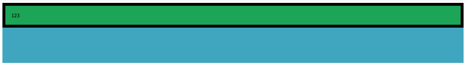
如果我想让box的横向宽度等于outer的横向宽度,这里并没有设置outer的宽度,有人就想用width:100%撑开box宽度,但效果却并没有和我们想象的一样。
可以发现box的宽度居然超过了outer的宽度,要知道width设置的宽度是内容区宽度,而我们在这里还设置了padding和border,也就是说box盒子最终宽度比outer多了60px。
正确做法:
  .box{
      background-color: rgb(28, 164, 87);
      position: absolute;
      padding: 20px;
      border: 10px solid black;
      left: 0px;
      right: 0px;   /*距离左边为0,距离右边为0*/
    }
.box{
background-color: rgb(28, 164, 87);
position: absolute;
padding: 20px;
border: 10px solid black;
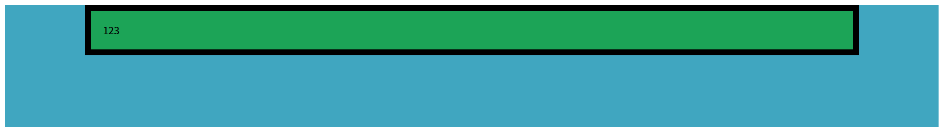
left: 130px;
right: 130px; /*距离左边为0,距离右边为0*/
}
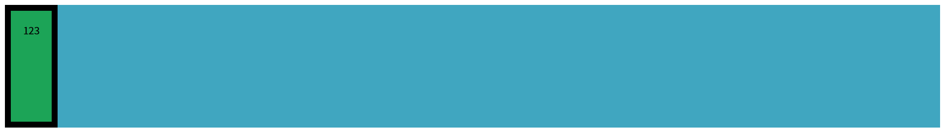
那若是想要box高度充满outer:
  .box{
      background-color: rgb(28, 164, 87);
      position: absolute;
      padding: 20px;
      border: 10px solid black;
      top: 0;
      bottom: 0;
    }
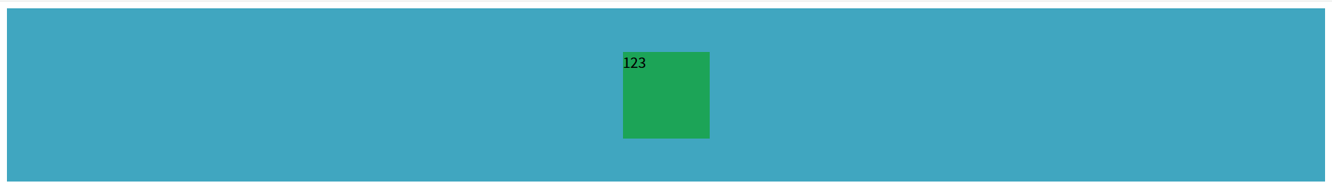
3.使子元素水平、垂直居中
子元素添加:
top: 0;
bottom: 0;
left: 0;
bottom: 0;
margin: auto;
 .outer{
      background-color: rgb(64, 166, 192);
      height: 200px;
      position: relative;
    }
    .box{
      background-color: rgb(28, 164, 87);
      width: 100px;
      height: 100px;
      position: absolute;
      top: 0;
      bottom: 0;
      left: 0;
      bottom: 0;
      margin: auto;
    }

火山引擎开发者社区是火山引擎打造的AI技术生态平台,聚焦Agent与大模型开发,提供豆包系列模型(图像/视频/视觉)、智能分析与会话工具,并配套评测集、动手实验室及行业案例库。社区通过技术沙龙、挑战赛等活动促进开发者成长,新用户可领50万Tokens权益,助力构建智能应用。
更多推荐
 14
14 0
0- 0


 已为社区贡献1条内容

所有评论(0)