echarts绘制天气预报图表
需要注意的是,当xAxis.position 的值为top时offset的正数是x轴距离图表顶部向上的距离,负数是x轴距离图表顶部向下的距离,当xAxis.position的值为bottom时则是相反的。实现第一个温度和第二个温度之间为虚线其他温度之间的为实线,是通过将温度数据使用两个折线显示,其中一个线段数据只有前两个有温度值,其他为'-',另一个线段的数据只有第一个是'-',其他都是温度数据。
效果图: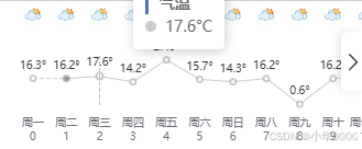
数据:
  tremOption={
    grid: {
      show: true,
          backgroundColor: 'transparent',
          opacity: 0.3,
          borderWidth: '0',
          top: '50',
          bottom: '40',
          left: '30',
          right: '30',
    },
    tooltip: {
      trigger: 'axis',
      // axisPointer: {
      //   type: 'shadow'
      // },
      formatter: (items) => {
        const name = items[0].seriesName;
        return `<div style="border-left: 3px solid #5470c6; padding-left: 10px"><strong>${name}</strong></div>` +
            items.map(i =>
                `${i.marker}  ${i.value}°C`
            ).join('<br>');
      }
    },
    legend: {
      show: false
    },
    xAxis: [
      // 日期
      {
        type: 'category',
        boundaryGap: false,
        position: 'top',
        offset: 130,
        zlevel: 100,
        axisLine: {
          show: false
        },
        axisTick: {
          show: false
        },
        axisLabel: {
          interval: 0,
          formatter: [
            '{a|{value}}'
          ].join('\n'),
          rich: {
            a: {
              // color: 'white',
              fontSize: 18
            }
          }
        },
        nameTextStyle: {

        },
        data:["一","二","三","四","五","六","日","八","九","十","十一"]
      },
      // 星期
      {
        type: 'category',
        boundaryGap: false,
        position: 'bottom',
        offset: 0,
        zlevel: 100,
        axisLine: {
          show: false
        },
        axisTick: {
          show: false
        },
        axisLabel: {
          interval: 0,
          formatter: function (value, index) {
            return [
              '{a|'+value+'}',
              '{b|'+index+'}'
            ].join('\n');
          },
          rich: {
            a: {
              // color: 'white',
              lineHeight: '16',
              fontSize: 10
            },
            b:{
              fontSize: 10,
            }
          }
        },
        nameTextStyle: {
          fontWeight: 'bold',
          fontSize: 19
        },
        data:["周一","周二","周三","周四","周五","周六","周日","周八","周九","周十","周十一"],
      },
      // 天气图标
      {
        type: 'category',
        boundaryGap: false,
        position: 'top',
        offset: 20,
        zlevel: 100,
        axisLine: {
          show: false
        },
        axisTick: {
          show: false
        },
        axisLabel: {
          interval: 0,
          formatter: function(value, index) {
            return '{' + index + '| }'
          },
          rich: (() => {
            const richConfig: any = {
              b: {
                fontSize: 10,
                lineHeight: 20,
                height: 20
              }
            };

            // 使用数组循环生成图标配置
            weatherIconsDataValue.forEach((icon, idx) => {
              richConfig[idx] = {
                backgroundColor: {
                  image: 'https://d.scggqx.com/forecast/img/多云.png',
                },
                height: 20,
                width: 20
              };
            });

            return richConfig;
          })()
        },
        nameTextStyle: {
          fontWeight: 'bold',
          fontSize: 13
        },
        data:["图标一","图标二","图标三","图标四","图标五","图标六","图标日","图标八","图标九","图标十","图标十一"]
      }
    ],
        yAxis: {
        type: 'value',
        show: false,
        axisLabel: {
        formatter: '{value}°',
          color: 'white'
    }
  },
    series: [
      {
        name: '气温',
        type: 'line',
        data:["-",{value:"16.2", symbol: 'circle'},"17.6","14.2","27.6","15.7","14.3","16.2","0.6","16.2","17.6"],
        symbol: 'emptyCircle',
        symbolSize: 5,
        showSymbol: true,
        itemStyle: {
          color: '#0003'
        },
        label: {
          show: true,
          position: 'top',
          distance: 3,
          // color: 'white',
          formatter: '{c}°',
          fontSize: 10,
        },
        lineStyle: {
          width: 1,
          // color: 'white'
        },
        areaStyle: {
          opacity: 1,
          color: 'transparent'
        }
      },
      {

        name: '气温',
        type: 'line',
        data: ["16.3", {value:"16.2", symbol: 'circle',  symbolSize: 7,},"-","-","-","-","-","-","-","-","-"],
        symbol: 'emptyCircle',
        symbolSize: 5,
        showSymbol: true,
        tooltip: {
          show: false,
        },
        itemStyle: {
          color: '#0003'
        },
        label: {
          show: true,
          position: 'top',
          distance: 3,
          // color: 'white',
          formatter: '{c}°',
          fontSize: 10,
        },
        lineStyle: {
          width: 1,
          type:'dashed',
        },
        areaStyle: {
          opacity: 1,
          color: 'transparent'
        }
      },
    ]
  };
实现这个图表的核心是:设置多个x轴,以及调整每个x轴的位置,来实现日期显示和天气图标显示以及通过图表的富文本属性rich显示天气图标:
天气图标是通过x轴的xAxis.axisLabel.formatter属性和xAxis.axisLabel.rich属性来实现:
axisLabel: {
          interval: 0,
          formatter: function(value, index) {
            return '{' + index + '| }'
          },
          rich: (() => {
            const richConfig: any = {
              b: {
                fontSize: 10,
                lineHeight: 20,
                height: 20
              }
            };

            // 使用数组循环生成图标配置
            weatherIconsDataValue.forEach((icon, idx) => {
              richConfig[idx] = {
                backgroundColor: {
                //图片链接
                  image: 'https://d.scggqx.com/forecast/img/多云.png',
                },
                height: 20,
                width: 20
              };
            });

            return richConfig;
          })()
},调整x轴位置是通过:xAxis. offset 属性和xAxis. position 属性:
 xAxis: [
      // 日期
      {
        type: 'category',
        boundaryGap: false,
        position: 'top',//调整x位置
        offset: 130,//调整x轴对于position属性位置的偏移值
        ...
需要注意的是,当xAxis.position 的值为top时offset的正数是x轴距离图表顶部向上的距离,负数是x轴距离图表顶部向下的距离,当xAxis.position的值为bottom时则是相反的。
控制折线图的位置使其在日期和图标x轴中间是通过:grid. top 和 grid. bottom 属性:
 grid: {
      show: true,
          backgroundColor: 'transparent',
          opacity: 0.3,
          borderWidth: '0',
          top: '50',
          bottom: '40',
          ...
实现第一个温度和第二个温度之间为虚线其他温度之间的为实线,是通过将温度数据使用两个折线显示,其中一个线段数据只有前两个有温度值,其他为'-',另一个线段的数据只有第一个是'-',其他都是温度数据。
series: [
      {
        name: '气温',
        type: 'line',
        data:["-",{value:"16.2", symbol: 'circle'},"17.6","14.2","27.6","15.7","14.3","16.2","0.6","16.2","17.6"],
        symbol: 'emptyCircle',
        symbolSize: 5,
        showSymbol: true,
        itemStyle: {
          color: '#0003'
        },
        label: {
          show: true,
          position: 'top',
          distance: 3,
          // color: 'white',
          formatter: '{c}°',
          fontSize: 10,
        },
        lineStyle: {
          width: 1,
          // color: 'white'
        },
        areaStyle: {
          opacity: 1,
          color: 'transparent'
        }
      },
      {

        name: '气温',
        type: 'line',
        data: ["16.3", {value:"16.2", symbol: 'circle',  symbolSize: 7,},"-","-","-","-","-","-","-","-","-"],
        symbol: 'emptyCircle',
        symbolSize: 5,
        showSymbol: true,
        tooltip: {
          show: false,
        },
        itemStyle: {
          color: '#0003'
        },
        label: {
          show: true,
          position: 'top',
          distance: 3,
          // color: 'white',
          formatter: '{c}°',
          fontSize: 10,
        },
        lineStyle: {
          width: 1,
          type:'dashed',
        },
        areaStyle: {
          opacity: 1,
          color: 'transparent'
        }
      },
    ]
火山引擎开发者社区是火山引擎打造的AI技术生态平台,聚焦Agent与大模型开发,提供豆包系列模型(图像/视频/视觉)、智能分析与会话工具,并配套评测集、动手实验室及行业案例库。社区通过技术沙龙、挑战赛等活动促进开发者成长,新用户可领50万Tokens权益,助力构建智能应用。
更多推荐
 10
10 0
0- 0


 已为社区贡献1条内容

所有评论(0)